Introduction
Conducting research is key to providing the user-centred perspective so valuable in ensuring that what you design is inline with your customers’ needs and expectations. But how do you process and present this research in a way that brings actionable, easy-to-communicate insights to the fore? This is where customer journey mapping and modeling comes in. Done well, journey maps serve as the bridge between research and design. They ensure innovation is aligned to the research insights gained.
What is a customer journey map?
A customer journey map is one of the modeling techniques we use to make sense of research. It is a visualisation of a user’s experience with a product or service as they attempt to accomplish a goal.
Customer journey maps:
- Are time-based/chronological
- Plot a user’s actions, thoughts and feelings throughout an experience
Journey maps usually show the experience of a persona or type of user. They bring the persona to life by showing their journey through time. You see how their goals, tasks, and anxieties/pain points play out through the various stages of an experience.

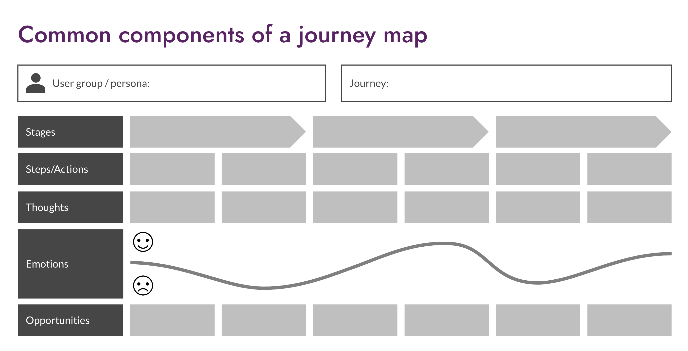
Customer journey maps come in all shapes and sizes. What you choose to map against a timeline may vary depending on what is of value to your project. However, you will often find the following common components in a customer journey map:
- A focus on a particular type of user engaging with a particular customer journey
- Customer actions grouped into journey stages
- Thoughts or questions arising as the customer journeys through these steps and stages
- The emotional journey illustrating the highs and lows of an experience
- Opportunities for improvement throughout the various stages of the journey

You can use a variety of research methods to build a customer journey map. This might include one or more of the following: depth interviews, contextual inquiry, usability testing, surveys, analytics, auto-ethnography and stakeholder workshops.
What else can you map?
There are other things that you can map against a timeline of customer actions.
For example, a service design blueprint maps a sequence of customer actions to the organisational activities that serve the customer. Service blueprints build a picture of how an organisation currently services the needs of the customer, or how they might like to do so in a future.
A mental-content model maps customer information needs at different stages of a journey to the content that serves those needs.
Why use customer journey maps?
Whatever the focus, these maps ensure innovations remain focused on users’ tasks, goals, or expectations. They build empathy with the customer and are a means to action, identifying problem areas and opportunities for innovation. And as they are concise and visually engaging, they can be an effective way to create a common vision among team members.
How can you use them? Some examples.
While many of the customer journeys that we produce are built upon research with customers, below we share examples where we used auto-ethnography techniques and drew upon existing knowledge in stakeholder workshops.
Using customer journey maps to improve the visitor experience at a national attraction
We investigated the visitor experience of a national attraction. They were experimenting with the use of iBeacons to inform visitors (via a smartphone app) about the exhibits they were seeing while making their way around the exhibits.
We spent two days on-site performing contextual research using an ‘auto-ethnographic’ approach. Researchers put themselves in the shoes of the visitor and walked through the experience gathering evidence as they went; from arriving at the venue and downloading the app, through to exploring key attractions and the surrounding grounds.

Each researcher built a diary of the highs and lows of the experience, using a mobile phone experience mapping app (shown above). Each data ‘moment’ records a note about what was happening, the geographical location at which it was taken, an emotional rating on a scale from positive to negative, and any pictures added by the researcher.
We compared the researchers’ maps to find the common highs and lows of their experiences. It allowed us to make evidence-based recommendations for improving the visitor experience.
In other projects, we have used the same experience mapping tool for research participants to document the experience for themselves, sometimes using the output of these maps as discussion prompts in follow-up interviews.
Mapping future services for a major UK charity
When a UK charity underwent rebranding, they engaged us to help them translate the overarching organisation’s value proposition to an individual service level. We first conducted a series of senior stakeholder interviews. We then facilitated a full-day workshop with several teams exploring different service areas, such as giving advice, retail products, social change and fundraising.
In the workshop, we and the stakeholders created pen portraits, empathy maps and an ’as-is’ service blueprint. We then ran a workshop with core stakeholders to help them create a business model canvas to communicate their digital transformation strategy to their senior stakeholders.

Above is an example of a service blueprint that was created during the workshop. It includes the following ‘swim lanes’ used to understand the retail service products area, including:
- Items that the user interacts with (for example, web pages, emails, or an advert)
- Customer actions – how the customer interacts with the charity
- ‘On stage’ employee actions that directly to support the customer actions
- ‘Offstage’ employee actions behind the scenes to support the customer interactions
- And finally, the support systems need to deliver the service
Leveraging customer journey maps to further engagement with a UK political institution
This institution wanted to gain insight on participants’ attitudes and behaviours when it comes to digital political engagement. The aim was to help inform a business case for future technology development and to identify the most effective public places to run campaigns.
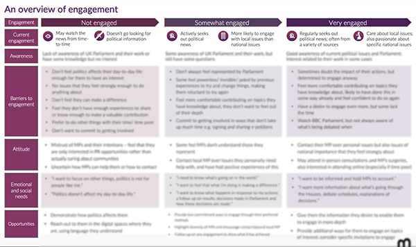
We ran a mix of quantitative and qualitative research with over 1,000 people from across the UK and created a customer journey map of engagement as part of the research findings report. It maps three levels of engagement and identifies opportunities at each stage to nudge people to become more engaged. The swim lanes are bespoke to this project. They included lanes for barriers to engagement and attitudes towards politicians.

This output is an example of how mapping can be used strategically, to consider people’s relationship to an organisation as a whole over time, rather than focusing on more specific tactical service or product improvements.
Using customer journey maps to improve the digital experience when visiting a major sporting event
We recently investigated the user experience of a sporting event’s digital app, before, during and after visiting the event.
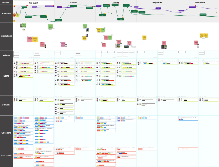
We ran usability testing on the app and we also conducted a ‘service safari’ study, where two of our researchers mapped their digital and physical experience as they visited the event (another example of using auto-ethnography to gain an understanding of visitor experiences).

The map:
- Headlines with the emotional experience of the two consultants
- Charts the activities at each stage of the visit
- Records the questions that the two researchers had as they went through the day
- Records the pain points and the plus points throughout the day
We used the map as an analysis tool to inform the report findings. We made comparisons between the findings from the user testing and the service safari to inform change recommendations on their app.
Want to find out more?
We hope you’ve enjoyed hearing about customer journey mapping and a few of the ways we’ve used it across physical and digital experiences on tactical design projects and more strategic pieces. If you think this activity may be something that your organisation could benefit from or you’d like to chat to us about any of this, please get in touch. We would love to hear from you.
Are you interested in learning more about journey mapping and other research modeling tools? We also offer a full-day training session to help you master these skills. Learn more about the Customer Journey Mapping, Modelling and Information Architecture training.


