A personal take on family ‘remote user testing’ that reveals interesting insights and a few usability heuristic contraventions…and a square fish.
Social distancing and social isolation has been a challenge for all of us over the last few weeks, but it’s been especially difficult for those isolating on their own. Whilst the younger generations among us can quickly reach for outside contact via their smartphones and social media platforms, for the elderly in this position, that may not be so simple.
Setting up the tech for elderly parents remotely
So for those of us with elderly parents or relatives that we can’t go and see physically, we may have found ourselves giving them a crash course in online chats, virtual meetings, video conferencing or whatever we want to call it.
My Mother lives alone 200 miles away so I have been trying to reduce the isolation she feels by introducing her to this technology. We bought her an iPad 2 years ago, but it never really addressed a need she had, and on discovering that her iPad no longer supported an iOS capable of running the likes of Skype, WhatsApp and Zoom we needed to find a plan B. We quickly dispatched a newer tablet to her already set up with these apps with all the contacts set up and ready to go.
Step 1 – WiFi
Getting her onto the wifi, the one thing we couldn’t set up before we posted the tablet. After 30 minutes and 4 attempts we achieved this goal. Selecting an option ‘wifi’ on the left of the Settings screen and entering the code on the right causes a multiple focus issue for the inexperienced user. Keeping these as single focus options would have enabled a quicker understanding. Show the user what their actions have led to clearly with a visibility of system status.
Entering the password was reasonably straightforward, mostly thanks to Android allowing the password to be revealed to ensure it had been entered correctly “Just tap on the ‘eye’ Mum!” I said. Apple take note, we are not all trying to hack into the Pentagon with someone looking over our shoulder, let us see what password we are entering to help error prevention.
Step 2 – WhatsApp
Although my wider goal was to instigate a wider call with the family involving more than 4 participants, I thought I’d kick things off with a simple 1 to 1 on what I felt was the simplest app for this task, WhatsApp.
As mentioned before, I had preloaded all these apps with the contacts of myself and my siblings so we wouldn’t need to try and add these remotely. So I tapped on my Mother’s name to instigate the call. Now bear in mind that I was on the landline phone to her throughout all this (on speakerphone of course) instructing her on what she should do and asking her what she was seeing on the screen, so I could hear she was receiving the WhatsApp call, all good.
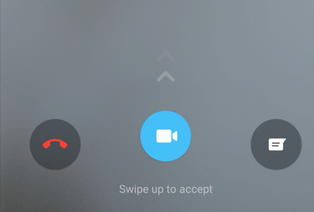
To accept the call she needed to press and swipe up the accept call icon. This breaks 2 interaction design guidelines:
- Match between system and the real world. She is used to answering the phone with a single push button, why not replicate that here with a single tap?
- Consistency and standards. Other online video call services require a single tap to accept a call, this break in convention creates an unnecessary issue.
- There are 3 options to replying to the this call, the red cancel or hang up option, ’Swipe up to accept’ and message. This breaks the aesthetic and minimalist design guideline, with 3 options competing for my Mother’s attention she doesn’t know what to do.
- Of these 3 options, there is no obvious ‘positive’ action. Her landline phone includes a green ‘accept’ option and a red ‘cancel’ option. Other appliances in her house follow this convention and for good reason, as it’s a recognised way of helping user’s interact with a system by pointing out the likely forward step. However the colour of this forward step in this situation is blue with a video camera icon (more on that soon). This breaks any mental model my Mother had for accepting a call.
- The ‘Swipe up to accept’ instruction was completely missed by my Mother, its size and contrast insufficient to catch her attention. I did increase the text size and alter the accessibility settings, but I am unaware as to whether this would have affected this particular instruction.
So as a result of these issues, answering the call was problematic. She could locate the icon and apply pressure onto it, but doing so whilst sliding up in a quick action that we all take for granted was just too much and after several attempts we had to abandon this method.
Plan B, could she call me? Let’s give that a go. Ok Mum, look for my name, that’s it now can you see the icon that looks a bit like a movie camera? No? Just to the right of my name? Oh the fish she says! Momentarily confused I then realise what she means, the video camera icon looks much more like a square fish than a video camera icon. YES I say, that one, tap that!

The joy on her face from seeing us on the screen as a result of this action was a wonderful sight to see. Success.
As we wanted to make this a regular occurrence, a few days later we’d call again. I thought this would be a breeze after the first call, but no, there was very little learned behaviour evident from my Mother and we pretty much had to start from scratch with her experiencing the same frustrations as the first time.
Since then we have introduced her to Zoom and Skype to see if these services proved more accessible to her. These have proved to be more successful as the interface felt more intuitive and explanatory to, but an unexpected issue arose when instigating a group call with 4 of us on the call. The cognitive overload she experienced when trying to understand if someone was talking to her on the screen. 4 heads all seemingly appearing to talk at once became overwhelming, so we have gone back to individual one to one calls with the square fish.
Steve Krug sums this up well:
“[Designing for accessibility] isn’t just the right thing; it’s profoundly the right thing to do, because the one argument that doesn’t get made nearly often enough is how extraordinarily better it makes some people’s lives. […] How many opportunities do we have to dramatically improve people’s lives just by doing our job a little better?”
Steve Krug
Want to learn more?
- Training course: Fundamentals of UX & Design Thinking
- Training course: Usability Testing
- Training course: Practical Accessibility


