Registering for a site or service is often, to put it frankly, a tedious and boring task. But although it’s not the ‘sexiest’ part of an interface, the registration process is a crucial element of any digital product, and can even be a determining factor in whether the user will actually continue to use the service… or not.
Get your registration forms right and you’ll increase sign-ups, conversion rates and user satisfaction – do them badly and it’s likely you’ll see bounce rates skyrocketing.
I recently worked on a project where I (and some other Bunnyfooters) evaluated the registration process for a digital lifestyle service to ensure optimal usability. So, with that in mind, I’m going to outline some of the key things we learned to help you optimise your registration process.
Clearly Communicate Your Proposition and Its Benefits
Explain your value proposition and its benefits clearly to the user to reduce ambiguity and improve persuasion. What will the user get by registering with your service? How will your product or service help them? How is your service different to others that may be considered similar to yours? (This will help them understand why they should go with you and not a competitor!)

Ensure ‘Log In’ and ‘Sign Up’ Are Prominent and Visually Differentiated
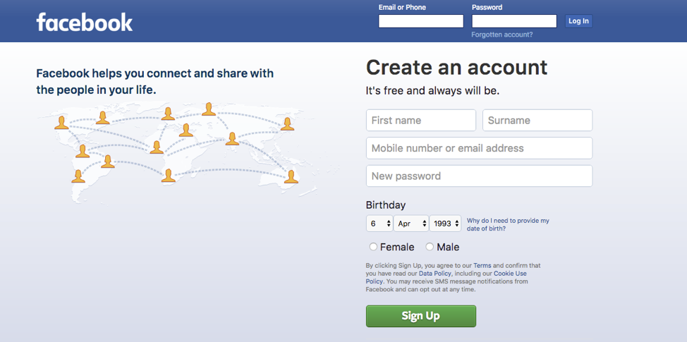
Make ‘log in’ and ‘sign up’ areas as visually different as possible to reduce any confusion, and make sure you place them both in prominent positions.

Here are some effective ways to avoid causing your users to accidentally try to log in using the registration fields:
- Avoid placing the login and registration forms next to each other
- Visually differentiate the login and registration buttons
- Use appropriate wording in labels – avoid using the term ‘sign in’ if you’re also using ‘sign up’
Allow Registration Using External Accounts
Provide alternative ways of registering such as social media accounts and/or Google to save your user time. It also means they won’t run into errors when filling out your form.
Keep Your Forms Short
When designing your registration forms, always keep in mind who the end user is and who you are designing the forms for. Avoid throwing in unnecessary questions for your own benefit, for example, to gather user data for future marketing campaigns. This will come at a risk of frustrating or confusing your users. Only ask questions that are truly essential.
Break The Process Into Small Steps If Needed
If it’s not possible to have a short registration process, consider breaking it down into small steps. Make sure the steps are ordered in a logical way to maintain an intuitive sequence and smooth experience.
Avoid Asking Intrusive Questions
If asking questions that could be perceived as personal (or worse, intrusive) is necessary, always state the reason why you are asking these questions to alleviate feelings of uncertainty your user might have. This is also a good way to build trust!
Improve Your Form Layout to Assist ‘Scanability’
There are a few easy ways to do this:
- Present content in a single-column layout
- Left-align labels
- Ensure fields and the related labels stand out visually to improve readability and accessibility
Get Your Error Handling Right
Error messages can affect the experience more than people would suspect; if they’re not done well, it can leave the user feeling negative about your proposition. Use explicit error messages that explain what went wrong and provide your users with guidance on how to fix the problem. Allow them to contact you if they feel stuck.

You could also consider providing inline validation right after the user has completed filling in a field, instead of showing an error page after they’ve clicked to proceed.
Although there are many examples where companies do this, it’s wise to avoid providing instant validation as the user is typing, as it can be confusing.
Improve the Password-Creation Process
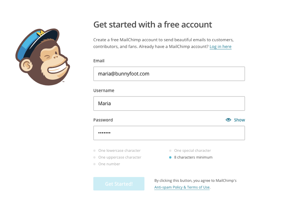
Show password requirements right away – not as an error message that follows after your users make a mistake. Ensure your password criteria are clearly visible when the password field is selected. MailChimp is a great example of this:

Let your user ‘unmask’ the password they have entered by providing a ‘show password’ option… mistyping is quite common when creating a password (especially if people are in a rush!). But make sure the unmask option is unselected by default.
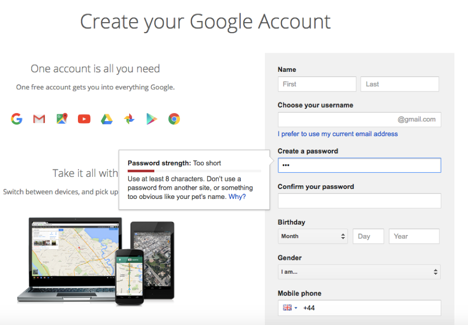
Showing password strength is another way to guide your users; a research conducted by Egelman et al. (2013) indicates that strength meters encourage users to create stronger passwords (and therefore, to protect themselves).

Ensure you have a smooth password retrieve process in place. There’s nothing more annoying than spending time trying to recover a forgotten password!
Avoid Using Placeholders Within Text Fields
Placeholders can hinder form completion and they also make fields less noticeable.
If some fields require an additional description to assist users to complete the form correctly (e.g. phone number and postcode fields), it’s best to place that text above the field, so it’s always visible.
Alternatively, consider recognising whatever format users chose for entering the data to avoid confusion.
Give Feedback
After the user has completed the form, give recognition of what they’ve completed to induce feelings of achievement and improve persuasion. They could have given up and opted to go with a competitor instead, but they didn’t – so make them feel like it was worth it!
It’s key to remember that best practice is not always the optimal solution; usability and user experience are tightly linked to context of use and the idiosyncrasies of the intended users. Always test your designs with representative users to ensure optimal usability and a positive user experience.
Want to learn more about how you can improve your registration process and conversion rates? Please get in touch.
Read more:
- Blog: 8 Ways You Can Build Trust Through Design
- Blog: A Straight Forward, Straight Talking Guide to Mental Models
- Training Course: Designing for Persuasion


