Think about a piece of creative – whether it’s a television advert, an email, a website or a physical object – that has had a lasting effect on you. It’s likely that as you’re picturing it, a huge part of what you remember will be the emotion you felt at the time. When you think about it, you won’t just recall what it was and what it looked like; you’ll remember if the images made you smile, or if the copy made you feel inspired.
In the same way as traditional art formxs like painting and poetry, contemporary design should always aim to inspire emotion. The organisations that manage to elicit an emotional response from their customers have a key advantage over those who “look nice” but not much else. Us humans like to think we’re rational beings who can remain objective (or at least, we think that of ourselves, even if we don’t think the same about others…), but the majority of the time, we make decisions based on a gut feeling – and our emotions play a huge part in influencing that.
I’m going to share five examples where design has been used to create an emotional reaction – and why I think they’re so great. If there are any examples you like that I’ve missed, let me know in the comments!
Get Out
By now, Get Out needs no introduction. It’s a great genre movie and was (rightly) recognised at this year’s Oscars. But before we all saw the film, we saw the poster – and it’s a good one.
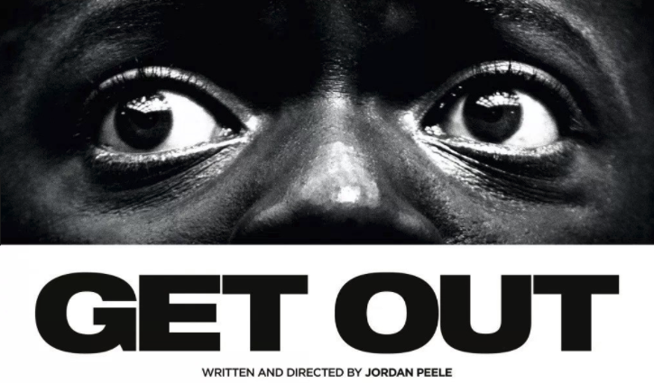
To heighten emotional pull, advertising gurus often refer to the “three Fs”: Food, Fear and F…ornincation. Many adverts play on a combination of these – or even all three – but it’s clear that the poster for Get Out is driven purely by the second f: fear.
It’s a clever choice to use only a close up of the main character’s eyes; it creates an uncomfortable intimacy and a claustrophobic closeness. Human beings are adept at sensing emotions just from the eyes of others – and the extreme close-up gives you no choice but to feel empathy with the fear and pain that the character is (clearly) experiencing. The black and white effect also gives the poster a ‘cold’ feeling, as does the haunting strapline: “Just because you’re invited, doesn’t mean you’re welcome.”
Cow and Gate
The Cow and Gate “Laughing Babies” television advert uses a similar method as the Get Out poster to stir emotion in its audience – a close up of the subject’s expression – but in this case, the visuals cause happiness.
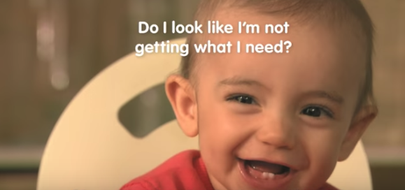
It’s likely that if you clicked on the link to watch the advert, it made you smile (or at least made you feel a little fuzzy). And why wouldn’t it? As (presumably) adult humans, we’re genetically programmed to respond to infants – something that this campaign plays on.
This advert has a more submerged level of emotion to it though, which is created by the copy on screen. This is clever for two main reasons. Firstly, it emphasises the joy that a happy baby can bring; the question, “Do I look like I’m not getting what I need?” forces the audience to concede that no, you don’t look like you’re not getting what you need – all thanks to Cow and Gate! Secondly, there’s a very subtle edge of guilt within the copy, which is emphasised by the double negatives used: if you don’t feed your baby Cow and Gate, will it be as happy and healthy as the babies you see on screen? For parents, there is, arguably, no stronger emotion than guilt, or the fear that you’re not being as good a mother / father as you could be – another reason why this advert is so effective.
MailChimp
This example has been used in a few other listicles I’ve seen – so I won’t go into too much detail – but I wanted to include it anyway, because it’s such a good one.
MailChimp is an online platform that enables freelancers and companies to send emails out to their network. However, “pushing the button” on an email campaign can be nerve-wracking, no matter how many times you’ve done it. So, how does MailChimp respond? With this pop-up:
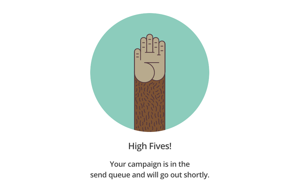
It’s a very small touch, but, is extremely rewarding to the user: it provides them with affirmation, fills them with a sense of achievement and makes them feel proud of themselves for a job well done.
Tesla
Tesla (the brand, rather than the vehicles) is all about pushing boundaries of what’s possible. It’s about the big picture; it’s about not letting anything get in the way of what you want to achieve. In a word? It’s exciting. And this is certainly reflected in the design used on Tesla’s website homepage.
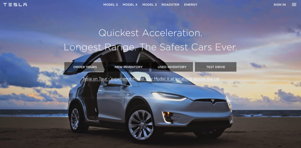
The design of the website spurs excitement in a few ways. Firstly, the fact that the entire homepage is essentially a video of the car driving through empty, open spaces is empowering – and reinforces the idea of limitless potential (empty road = blank canvas). It’s also an interesting decision to not show the driver’s face – meaning it could be anyone… including you!
Secondly, the copy is a series of short statements rather than sentences, building urgency and tension – both of which contribute to a feeling of excitement in the audience. Being a newer brand on to the market, they also – cleverly – make potential customers feel reassured by addressing many of the key discussion points of buying a car: Do you like a car that goes fast, quickly? “Quickest acceleration.” Or maybe you care about the environment, so want your car to be economical? “Longest range.” Do you have children, and just need a car that will put your mind at ease? “The safest cars ever.”
Fearless Girl
Again, this is one that has been covered several times before: but as a piece of design, the statue of Fearless Girl is one of the most effective in recent memory.
In the middle of Wall Street, the four-foot bronze statue of a young girl stares down the Charging Bull structure that, for years, represented the might of the capitalist system in the states.
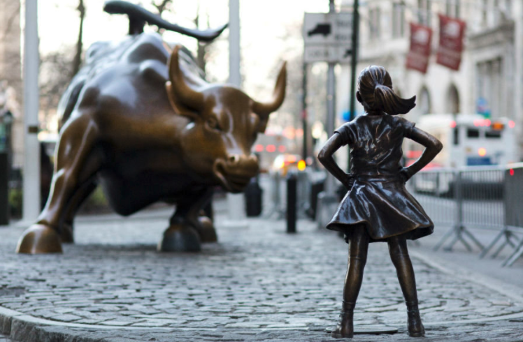
Despite the backlash that followed – which accused the statue of being a marketing ploy, rather than the symbol of gender equality it claimed to be – it’s hard to not be affected by the courageousness of the statue’s pose and the defiant placement of the girl’s hands on her hips.
Customer experiences can be made exceptional by generating an emotional response through design. At Bunnyfoot, we’re leaders in designing experiences – both online and off – that will help you build a relationship with your customers. If you think we can help you, please get in touch!
Learn more…

Related Posts