We recently ran our Design for Persuasion course where we look at ways to inspire trust, build emotional rapport and trigger action amongst your target audience. To get a good mix of knowledge and practical application we asked our participants to work on a design challenge, giving expression to some of the principles learnt.
We set them the task of redesigning the homepage of an existing small building services website. We chose this website for a couple of reasons. As a company (and service) most will not have heard of, the website has to work much harder to gain a potential customer’s confidence. The site currently includes some content relevant to trust and persuasion principles, but it mostly neglects these on its homepage so it provided a good starting point for a rethink.

The wireframe below is based on the pen and paper sketches made by the participants on the day. Our thanks go to our participants for the enthusiasm they applied to this. The elements included relate to a sample of the trust, emotion and persuasion principles discussed during the course. Each item has been numbered in the wireframe and a corresponding explanation given below.
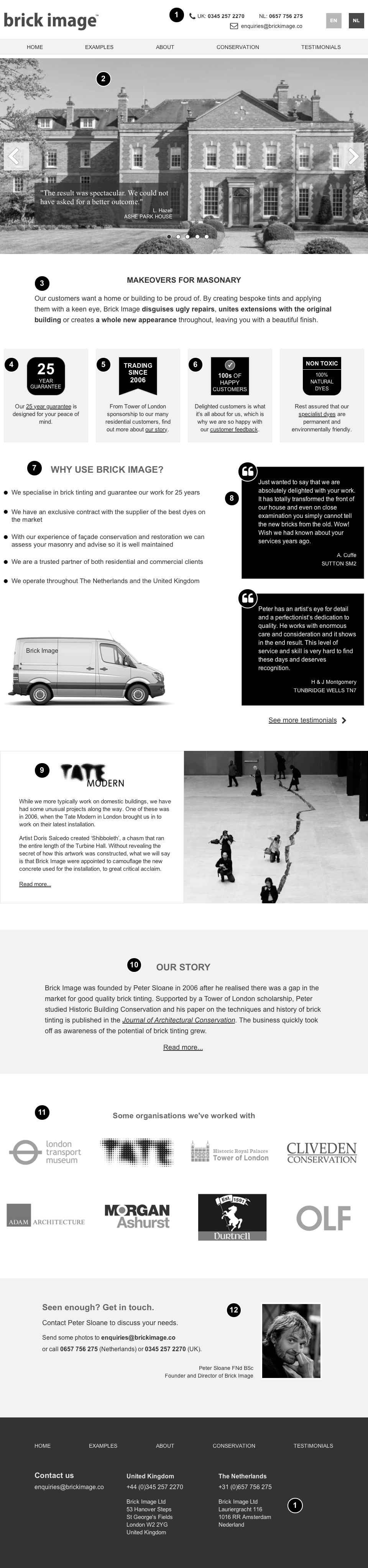
- Contact information (header and footer)
Providing contact details on all pages, rather than on a separate contact us page, makes your presence in the offline world more visible and reassures visitors that you are easily contactable. It also follows the principle that if you want somebody to do something (i.e. contacting you), make it easy for them. - Photograph carousel
Carefully selected imagery in a ‘hero’ carousel could serve various functions:- Leading with a photograph of an employee working on a beautiful house would demonstrate that “people with houses like this trust us (so you can too).”
- Attractive imagery triggers an emotional response, both ‘visceral’ (“ooh, that looks good”) and reflective (“maybe my house could look better too”).
- More detailed ‘action shots’ could educate customers curious to know whether the service is applicable to their needs.
- Accompanying images with short testimonials introduces ‘social proof’ to the mix, encouraging the reader to conclude “others have had a good experience with the company I probably will as well.”
- Compelling reason to act
Displaying a short explanation of the problems that the service can address, together with an emotional reason as to why they may wish to do so (“our customers want a home or building to be proud of”) provides a compelling reason for people to take action. - Highlight trustworthy policies
Highlighting trustworthy policies such as guarantees and environmental credentials further builds a sense of trust in the visitor. Also remind people of the emotional benefits of these trustworthy policies (such as ‘peace of mind’). - Highlight longevity
Pointing out longevity (‘Trading since 2006’) further builds trust as it indicates experience and a likelihood to fulfil commitments. - Social proof
Websites frequently use social proof indicators. This is because we look to others for guidance when we are unsure of a course of action. If we can see that others use a service (“100s of happy customers”), it increases the likelihood that we will do so also. Linking through to testimonials reinforces this and enables people to learn from other’s experiences. - Address your customers’ values and concerns
It is important to research what questions, concerns and values your potential customers may have when looking to engage with a service or product. Addressing these information needs in small manageable chunks of information makes it more likely people will read this when they scan your homepage. - More social proof – testimonials
Previous customer testimonials are an important source of social proof. You may have a section of your website dedicated to customer feedback, but placing a couple of testimonials on your homepage makes it more likely that visitors will stick around long enough to find the others. Try to choose testimonials that speak to potential customers’ desires and concerns. - Reflected authority
If there is something that makes you stand out from the crowd, use it! If you have an association with a well-known and reputable institution, this gives visitors to your website another reason to trust you and consider you an authority in your field. Associating yourself with well-known brands or individuals produces what is sometimes referred to as the ‘halo effect.’ A little of their celebrity or prestige shines on you also. - The power of a good story (plus authority/expertise indicators)
We all love a good story. Placing the introduction to your story here allows people to start building an emotional connection with you. The example here includes information that adds to the perception of expertise (association with the Tower of London and a published paper in an academic journal). When writing an ‘about us’ section make sure to construct a compelling narrative that will arouse some emotional connection between the reader and you. - More social proof
Placing the logos of companies that you have worked is a commonly used ‘social proof’ method that shows you to be a trusted partner of other organisations. The more your potential customers recognise these organisations and associate positive attributes with them, the better. - Clear call to action and make it personal
It is important to include a clear ‘call to action’ showing the visitor what their next action can be (in this case “Get in touch to discuss your needs”). Including a name and photograph of the company owner with this ‘contact us’ call to action enables the reader to begin feeling a personal connection.
But…always test your design
The elements listed above are just a few of the design principles described on the Design for Persuasion course. Choosing the right techniques for each situation and scenario is important. Ideally, persuasion factors are researched, designed and validated much like any other design item or feature. Understanding the perspectives and needs of your potential audience and user testing your designs is crucial to a successful design.
Want to learn more?
Design for persuasion is interesting and powerful because it is based on science (social psychology and behavioural economics mainly) and validated through experimentation. There are established rules, some of which are more obvious and some of which will surprise you. It can be implemented tactically (as we have shown in this article) but also strategically, where a whole persuasive experience can be ‘architected.’ If you are interested in learning more, we’d love to meet you on our next training course.
- Training course: Design for persuasion
- Training course: Design for the human mind

Related Posts