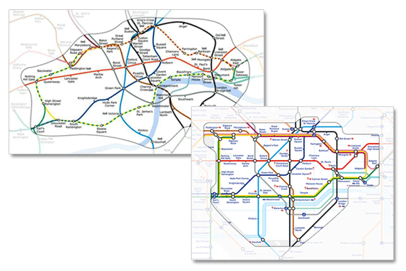
The key to good communication is to know exactly what to communicate to your audience so you can help them do whatever they are doing. This focus on audience needs is more important than being squeaky clean with reality. When backed by clear insight into the needs of your audience this means you aren’t really lying at all (that would be dishonest and despicable) – rather you are ‘enhancing the truth’ and communicating well according to your audiences goals.
Lessons from the London Underground

Last week on University Challenge a set of questions for the students was to identify London underground stations on a map which was drawn with geographic accuracy rather than in the iconic Harry Beck 1931 style. It looked a mess (the one above is a slightly cleaner version with labels) and the eggheads only got 1 out of 3. I was quite surprised that I managed 2 out of 3 and was only one stop away with the one I got wrong – but what I realised I was doing was visualising the iconic map (that alas I know quite well) and then transposing this mental image back on the alternative true spatial map. Essentially I was using a simple representation to inform a more complex one – something that graphs, maps, flow diagrams and all other types of information visualisation are supposed to do.
As most of my movements around London are subterranean I have no idea really of where anything is in true relationship to each other above ground and have frequently taken 15 minutes to go by underground to places I could have walked in 5 – but that’s not the point really – for my (and most other people’s) main goal of travelling to the right station and making the right connections, the iconic ‘false’ map works brilliantly – and it looks great too.
For successful communication know thy user and a couple of other tricks of the trade
The important thing is that any successful information visualisation does not require the veridical truth but rather a clear understanding of the audience’s primary goals for using the information. Focussing on the goals allows the designer to subvert the truth and remove unnecessary detail for the sake of clarity. It also helps of course if they know fundamental rules of human perception (colour discrimination, contrast sensitivity, perceptual grouping etc.) to further enhance the information visualisation, and making it aesthetically pleasing is also important and there are some ‘rules’ for this too but also a need for creativity.

Of course none of this is particularly new, think cave paintings, hieroglyphs, the Mercator projection for the world, and countless others – all these representations focus on the audience needs from the visual representation – and you should too.
See also:
- Wikipedia: tube map | London Undergroud geographic maps
- Geofftech.co.uk: loads of different representations of the london tube – who would have thought there were so many
- Bunnyfoot.com: User centred design services including customer insight, information visualisation, testing


