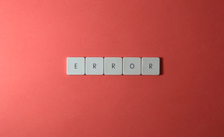
Why is it that Apple’s App Store hosts over 200, 000 apps and has served over 3 billion app downloads despite only being launched a mere two years ago? What makes apps so popular and how do you harness that popularity?

Our most recent app testing for a major household name revealed 2 key reasons why apps were preferred to browsing the web: people like apps because they are immediate and … Read the rest of this entry »

Tag Tags: , ,

Comments No Comments »

APB game advertIt is sad news this morning to see Dundee based game developers ’Realtime Worlds’ going into administration. So, what happened? … Read the rest of this entry »

Tag Tags: ,

Comments No Comments »

It’s a hot June morning as a black taxi pulls up on a tree-lined road in front of what was once an officer’s mess. The rambling corridors have now become the perfect rabbit warren for Bunnyfoot and other innovative businesses in what is now “Harwell Innovation Centre”.

As 4 people climb out and I hear the chatter and laughter of different accents, excited about the day ahead, I remember why I was drawn to this company in the first place. I see the laptops, the overnight bags and large art cases hiding a multitude of intriguing props they’ve brought to take part in Bunnyfoot’s Annual Training Day. … Read the rest of this entry »

Tag Tags:

Comments No Comments »

Inside Inamo Restaurant - showing interactive tables with touchpads

Inside Inamo Restaurant

Inamo restaurant in London is using a new way to attract customers, with the world’s first interactive ordering system using overhead projection technology: an ‘e-table’. The aim of this is to give the diner control over the dining experience.

Diners sit at a table, and rather than use a paper menu, they place their order through a food and drinks menu that is projected onto the table surface. As well as ordering food, diners can change their table cloth, browse food, play games, request and review the bill, look for things to do in London, and order a taxi. … Read the rest of this entry »

Tag Tags: , , , ,

Comments 2 Comments »

Neil outlines important analytics questionsLast week we held a Digital Masterclass to raise money for this year’s chosen Bunnyfoot charity event, The CARE Challenge. We were thrilled by the turnout and support from our clients and friends, all at short notice. All in all we managed to raise over £600. To those who came along or donated — we salute you! … Read the rest of this entry »

Tag

Comments 4 Comments »

James Cameron's Avatar

Public interest in avatars has increased thanks to a recent James Cameron film (20th Century Fox)

No longer are avatars the ideas and projects saved for geeks or the games industry. Since the massive success of James Cameron’s film Avatar, the wider public have been exposed to not only the concept and possibility of 3D virtual worlds, but the technology behind creating and controlling an avatar.

The development of personalised intelligent media is fast progressing and will soon provide us with … Read the rest of this entry »

Tag

Comments 1 Comment »

One of the great attractions in Edinburgh is the Zoo, my kids love it. We have been members for five years and spend many days of the summer holidays wandering around. Over the last few years I’ve seen the Zoo marketing develop and on my last visit was particularly impressed by their recent flyers. They have successfully combined maps, plans for the future, members information and all manner of other info into one neat, slick and usable handout.Edinburgh Zoo Flyer

The flyer is a standard DL sized concertina folded affair but what nicely sets it apart is that it has a built in information architecture and is really easy to use.

The concertina has an offset fold that exposes a small border. The borders show the title of that section and make it easy to find and fold to that section. The borders act in the same way as tabs do within a webpage. Tabs are used to show off sections within the flyerThey conceal a large amount of information in a small space and provide the user with a quick introduction to the contents.

Having these tabs makes it easy to find the section you are interested in and avoids the problem of either having to open up the entire concertina or folding it up in some weird way to expose the bit that you are interested in.

If the zoo were not a fantastic trip in and of itself, I would heartily recommend popping along just to pick up one of these flyers.

If you’re aware of any similar excellent examples we’d love to hear about them.

Flyer opens out to display lots of information about what's going on

Lots of information becomes easily accessible

Tag Tags: , , ,

Comments 1 Comment »

Looking to understand a little more about how eye tracking works?

Take a trip into the human mind through Rob Steven’s talk “The Emotion of Surprise” from Brandhouse Digital Sparks

http://www.brandhouse.co.uk/digitalsparks/

Rob Steven presenting

Tag Tags: , ,

Comments 2 Comments »

Advances in mobile, social media and gaming technologies have moved the field of user experience into almost all areas of our daily lives. This has created a shift away from traditional usability (as you knew it) to the much richer scope of user experience, where users’ feelings, motivations, and values are given as much, if not more, importance than the traditional measures of efficiency effectiveness and subjective satisfaction.

Social media in its broadest sense is the opportunity for people to have a conversation in various places and in a variety of ways. It covers linked in groups, facebook, myspace, virtual communities, slideshare, flickr, dig, delicious, you tube and various blogging platforms like twitter and wordpress etc

By these various platforms your average Jack (or Jill) can broadcast a “word of mouth” conversation to thousands all over the world. For brands it enables creation of a loyal community, being closer to consumer opinion and innovation. Handled well, brands can create a stronger emotional engagement for users with lasting reach. This means better bottom line results, whether measured by traffic, sales, retention or recommendations.

As the use of social media becomes more mainstream for companies, we often come across it during user testing sessions. Below are my three top tips for getting the best user experience from your social media activities.

Bunnyfoot’s 3 C’s of social media user experience;

Community:

  • Take the time to know your community / users. This will ensure you engage them with appropriate use of social media.
  • Know what content they are interested in, why they have joined your community and then ensure they are rewarded with appropriate content.
  • Don’t miss an opportunity to innovate always be thinking how you can use social media to make their lives a little easier e.g in the case of a cooking TV channel, provide the option for the shopping list to be texted to a phone or link directly to online shopping where they can order all the ingredients immediately.

Conversation:

  • Make sure there is relevant and up to date content, which means dedicating resource.
  • Don’t socially squat. Having a share link to your twitter account or action to join your facebook page is not a conversation or strategy for growth.
  • Be real. We ran testing last month where the ‘Discussion’ area was, in fact, a pre loaded Q&A section, not in real time and not what was expected. Furthermore the facebook page offered little value to users, so they had no reason to either ‘like’ it or suggest it to their friends.

Content:

  • Be relevant. If your social media strategy includes the use of blogs or TV channels make sure these are relevant to your user group and the most effective way to get the message across. We ran some testing on a site for 13-16year olds – they immediately engaged with the videos but switched off after a few seconds when they realised the content wasn’t interesting to them.
  • The length of videos should depend on the context, however generally best to keep them as short as possible.
  • Allow interaction to ensure people can skip in the video and comment on its value.
  • Don’t clutter or overload the page with calls to action if you want to use the channel as a driver to purchase products.

Tag Tags: , ,

Comments 1 Comment »

Wireframing with a desktop app? Oh come on – that’s so 2009.

Recent months have seen a slew of online web apps specifically for the creation of low-fidelity, clickable prototypes. It all started with “Balsamiq” some time ago now (complete with Comic Sans default font scandal) and has quickly progressed to an alarming array of free and affordable options.

Over at Bunnyfoot towers we’ve been giving them a spin. Here’s a quick rundown.

Mockflow

http://www.mockflow.com/

Pricing: 1 mockup with 4 pages is free, or $49 per year for pretty much unrestricted use.

The overall experience feels swift and straightforward after initial bump of a UI learning curve. The key differentiator over others on test here is the ability to co-edit mockups with collaborators. Online chat is also built in, making it easy to work together to craft your dream app.

Other nice features include align guides as you draw, a comprehensive library of components and quick and easy sharing (both private and public).

The main gripe whilst editing was the lack of keyboard shortcuts (at least on a Mac), making every copy and paste a menu selection.

screen shot of the mockflow application

screen shot of the mockflow application

iPlotz

http://www.iplotz.com

Pricing: free for 1 mockup with 5 pages. Subscription packages from $15 per month to $495 for 10 users with desktop and online access.

Phew. iPlotz is a beast. As well as wireframing, you also get an array of project management features, including to-do lists and completion status. There are also other powerful features such as version control, fine drawing tools, HTML export and annotations. It also makes a mean cappucino if you ask nicely enough!

Putting together a mockup is fairly straight-forward, once you’ve become accustomed to the (quite busy) interface. The default “sketchy” style is similar in feel to Balsamiq (see below), but a little less “play school” in feel.

Of course the trade-off with many powerful features is simplicity. The overall experience is more akin to a desktop app and takes some determined effort to feel comfortable.

screen shot of the iplotz application

screen shot of the iplotz application

Balsamiq

http://www.balsamiq.com

Pricing: free for online use, $79 for desktop app.

Balsamiq is fairly well known in web circles, and courted controversy with it’s choice of the oft-slammed font Comic Sans as a default (although you can change this).

The overall experience is not bad: drag, drop and edit works reasonably well. You can also search for widgets and add them to your canvas with the press of an enter key, speeding up the drawing process. There are some nice human touches: there’s an inspirational design quote as the app loads.

You can export your design, but unfortunately you can’t easily share your mockups – you need the desktop version to do this.

Overall, the end result feels a little too playful for serious heavy duty projects – we’re not sure how well it would go down in the financial sector for example.

screen shot of the balsamiq application

screen shot of the balsamiq application

Mocking Bird

http://gomockingbird.com

Pricing: free (currently still in beta).

Probably the slickest of the apps on offer here, Mocking Bird has a clean look and easy to learn UI.

Like Balsamiq, you can get stuck in and create a mockup without creating an account (you get a prompt to signup on save).

There’s nothing drastically new on offer in terms of drawing tools, but they work well and there’s a comprehensive library of components to start you off.

Public sharing is also pretty straight-forward, making it easy to send out a link for user feedback. There’s no private sharing unfortunately, although the URL is sufficiently obscure.

On the downside, it’s not straightforward to create precise pixel width layouts (there’s no ruler or way to specify exact sizes) and no page masters or templates to save on copy and pasting.
So will we be throwing away Axure anytime soon? Well, the job is not entirely done — there’s a gulf between quick and dirty concept tools and full-blown, enterprise standard specifications. It also requires a client with a good understanding of the design and user research process and confidence in the value of low-fidelity, disposable prototypes. Oh, and maybe a soft-spot for Comic Sans.

screen shot of the mockingbird application

screen shot of the mockingbird application

The biggest boon has got to be the ease and speed of sharing (anyone trying to upload an Axure prototype with its 1,000s of spacer gifs via a slow connection will feel our pain). It’s dead easy to get an idea online for client review and a rapid round of user feedback.

Got your own favourite, or an opinion on these apps? Have  you used them on client projects? Let us know.
Author: Neil Collman, Senior Consultant, Edinburgh

Tag Tags: , , , , , ,

Comments 3 Comments »